Branding the 2023-24 Nashville Ballet Season
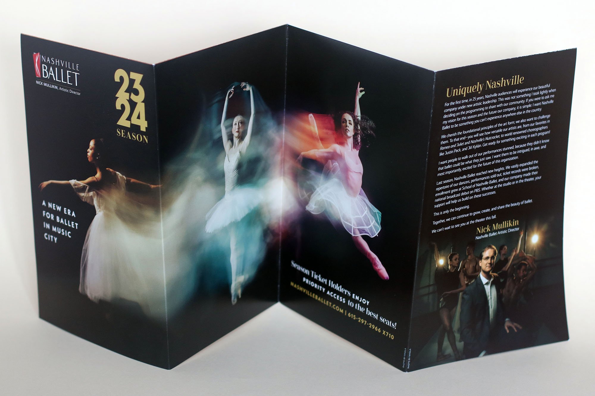
The new ballet season, which typically doesn’t begin until the fall, is planned before the previous one is even finished—back in January and February. This year, Nashville Ballet has a new artistic Director, Nick Mullikin, and an exciting preview announcement was called for to announce the change. Local photographers MA2LA took photos and video of the dancers in costumes that spanned the history of ballet—from soft Renaissance to square acid yellow tutus, but always en pointe! One of the featured images showed a transition with three dancers spinning across the screen. I immediately had an idea of how to use this long horizontal image in the Season brochure. I pictured in my mind a brochure that unfolded to reveal the entire image plus an Artistic Director letter and then unfolded again to reveal the performances.
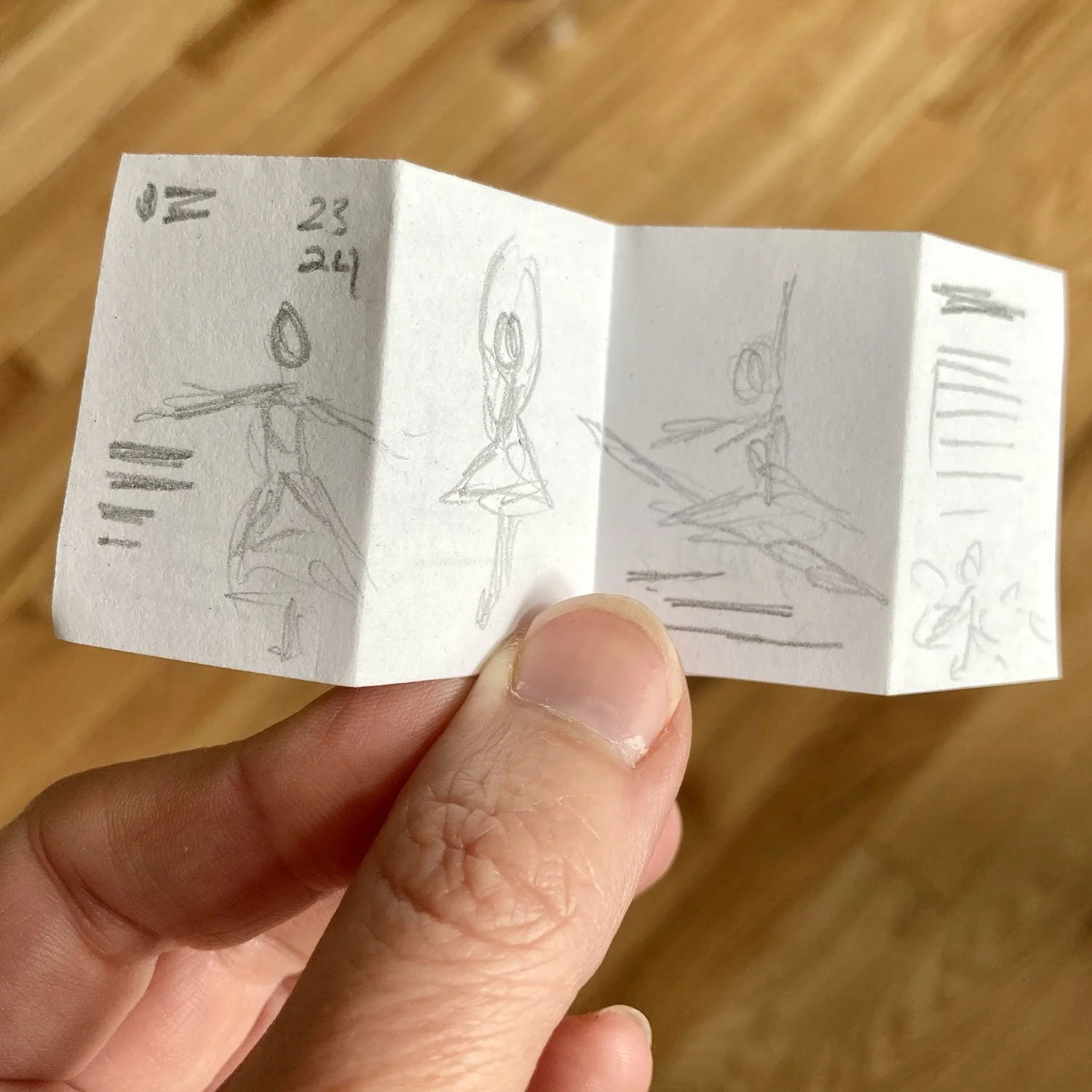
I start by presenting a small folding dummy to communicate my concept. And when I mean small—I mean only a few inches across. The smaller I work, the faster I can try out multiple ideas and folds without wasting a lot of time or resources. I think they are adorable—and nothing beats a physical representation of your idea. Many a time something I thought of or sketched out bombed once I tried to cut and fold it. But it makes it easy to see my mistakes and work out a solution. Clients like the tiny folds too!
Next was designing the look of the Season announcement and choosing a color palette, which would be featured in emails, the website, and social channels and needed to be ready the minute the 2022-23 Season was done in May. It closely resembled the front cover of the Season brochure. I originally wanted to reference the time transition showcased in the photos and video with typography, but we ultimately decided a simpler approach allowed the photography to shine.
After the announcement was finalized, it was time to move on to learning about the ballets that would be featured next season—always a mix of classic and contemporary. One struggle is designing for ballets that have not yet been finalized. Often I am only given a vague theme, and as I have worked for the Ballet over these past few years, I have been surprised by how quickly an entirely new production comes together in just a few months. New music composed, new dances choreographed and practiced, sets, lighting, costumes, and bam! Suddenly the whole ballet comes together the week before. But the design and marketing must be finished months beforehand.
Firebird visual and historical research
For the Season brochure, I focused my design energy on the classic ballets, which may vary from the originals in styling, but tell the same story (this year Firebird and Romeo & Juliet). I begin by doing visual and historical research so that I know as much as possible before the design stage. For contemporary ballets that are yet to be choreographed, I rely on the suite of brand fonts I have pulled together for the Nashville Ballet, as well as a color palette chosen for 2023-24. This gives the marketing consistency and allows for some flexibility later in the year so I can make updates to the performance branding to more closely represent its theme and style.
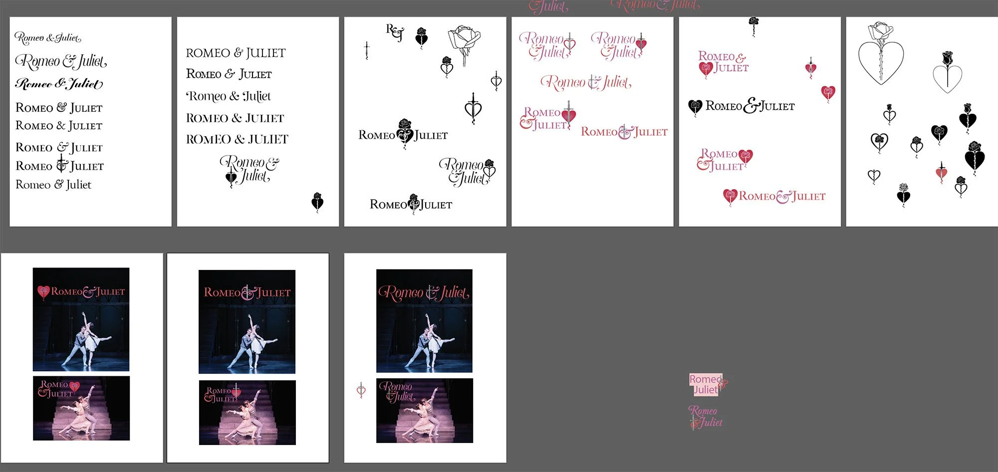
Then I move on to sketching ideas for the performances. I tend to write out a braindump of word associations to get warmed up, then sketch out a few ideas before moving to the computer to search for appropriate fonts. For Firebird, I really fell in love with the idea of incorporating the FIrebird into the “b,” but ultimately it was nixed because it was too classic looking, and this Firebird is futuristic in nature. Instead, I weaved a minimalist feather (inspired by mid-century design) through the letterforms and added a fiery blend of colors to the letters. Paul Vasterling’s Romeo & Juliet is set in Renaissance Italy, so I focused on classic typography and symbolism. I sketched roses, hearts, daggers, and blood, but none of them quite worked. Ultimately, we settled on a delicate script with a beautiful ampersand. It is so important to do lots of exploration before presenting a concept—sometimes one has to get all the cliches out and onto paper before discovering the winning design.
Nashville Ballet 2023-24 Season brochure reveal.
The best part of working on the Nashville Ballet Season brochure, is I know I will be able to repurpose this design in dozens of ways, as well as expand on the brand work done for each performance. The Season opens tomorrow with the inaugural Nashville Dance Festival in the beautiful Fisher Center at Belmont University. Tickets are still available!


