

Branding the Nashville Shakespeare Festival with Color, Concept, and Collage
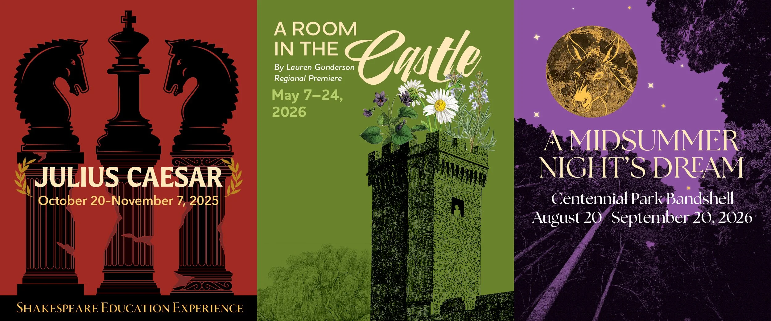
Nashville Shakespeare Festival wanted to reinvigorate its marketing with a bold, unified look for its 2025-26 Season.
Like many nonprofits that have been around for a long time, they felt like their font and color scheme had become stale, but they were not ready for a full rebrand.
They shared with me that the original Globe Theater in England used colored flags to indicate a play’s theme. So, to NSF’s original navy and goldenrod brand colors, we added white (comedy), black (tragedy), tomato red (history), lilac (romance), and lime green (nature), with a set of corresponding deeper and lighter versions of the palette for flexibility.
Their type palette suffered from both too much personality via a display font, and too little in a basic sans serif. I added Garamond (originally designed in mid-16th century, around Shakespeare’s time), a soft bold sans serif for children’s programming (a good match to their brand font), and a script, for when they wanted to reference the hand-drawn lettering of Shakespeare. We didn't want to eliminate anything from the current brand; instead, we refreshed it with flexible tools to reestablish consistency in NSF’s marketing.
“Working with Jenni at Luminea Creative has been an absolute joy. She brings a strong collaborative spirit, deep industry knowledge, and a process that is both clear and highly professional.
Jenni communicates with clarity, listens thoughtfully, and creates an environment where ideas can grow while still keeping the work focused and intentional. She makes you feel like a true creative partner throughout the entire process.”
2025-26 Season Branding
When planning concepts for the 2025-26 Season, Nashville Shakespeare Festival requested designs that were conceptual, impactful, and could be promoted as a set. I loved the idea of collaging contrasting elements into each design and using the new, expanded color palette to flood each design with a representative color.
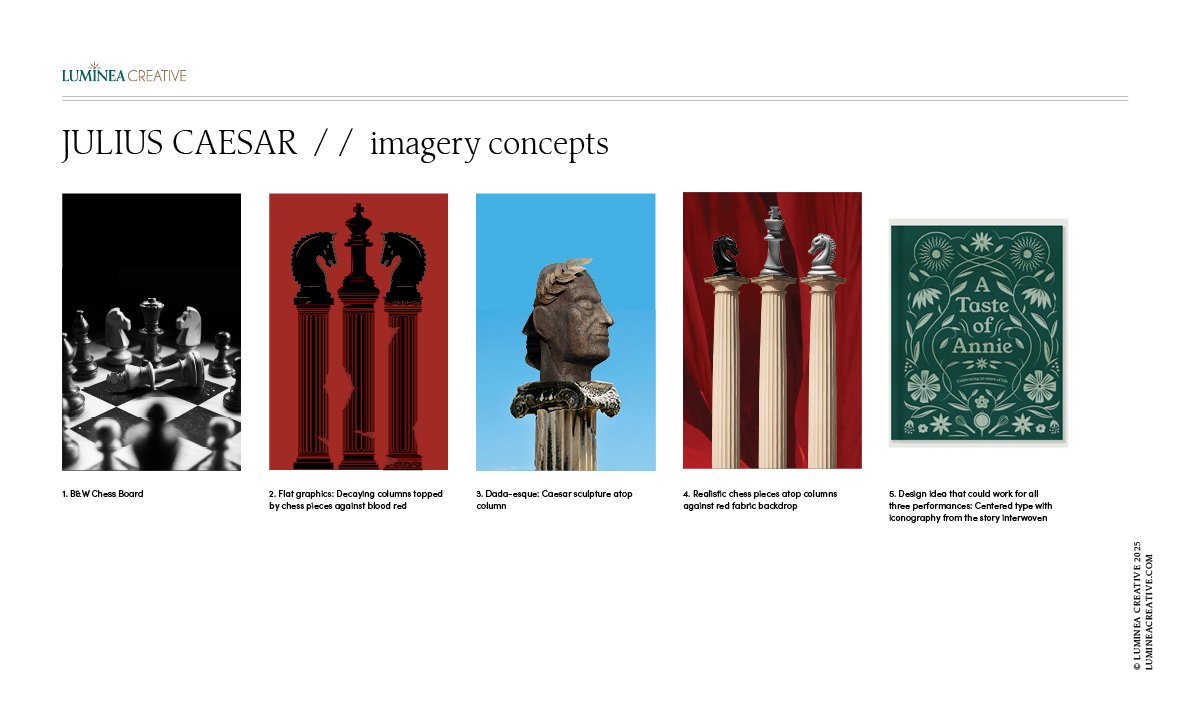
Imagery concepts for the Julius Caesar poster design.
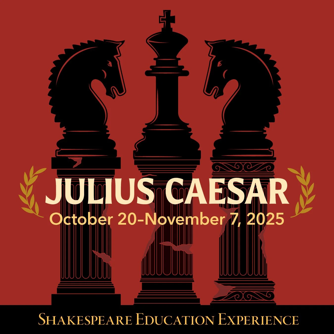
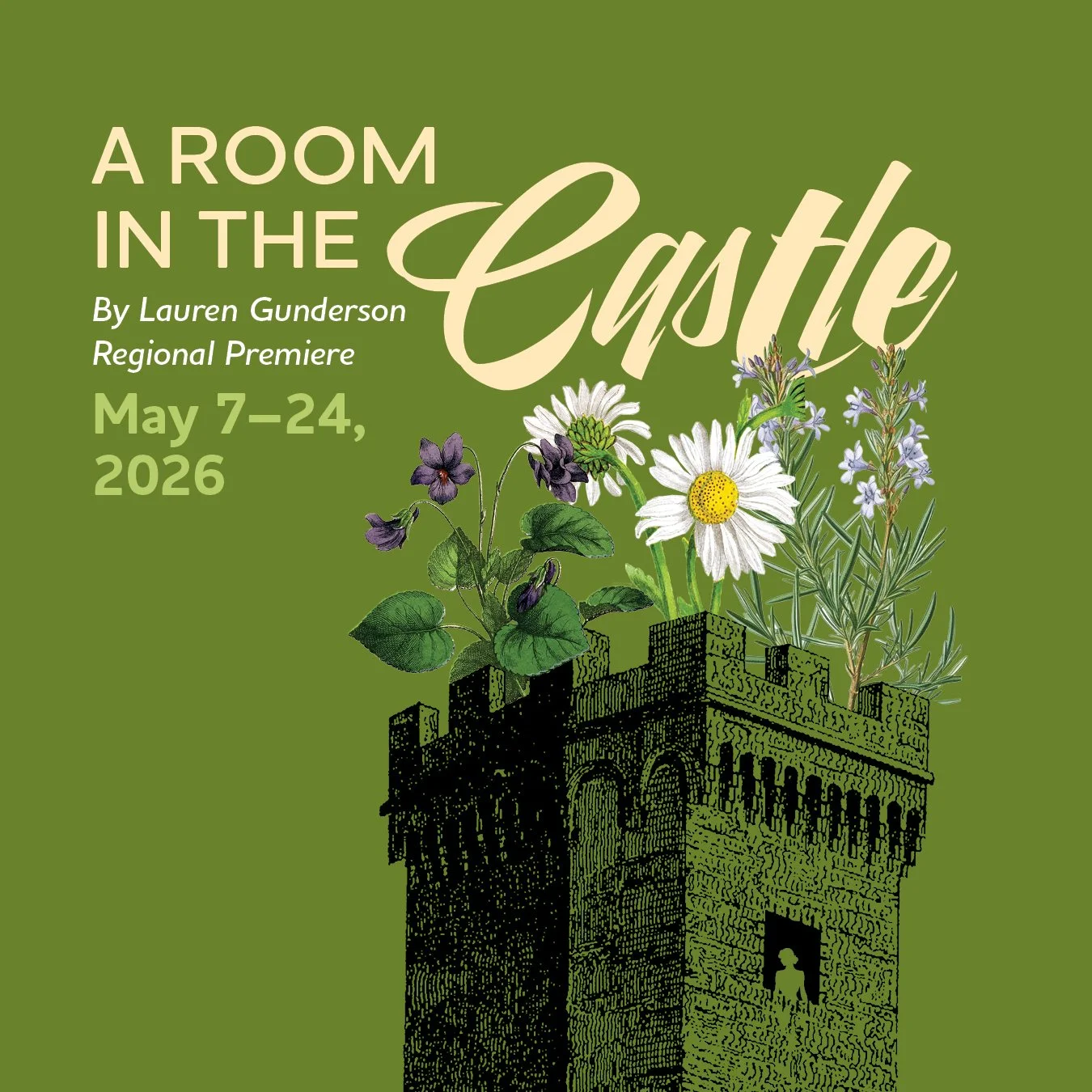
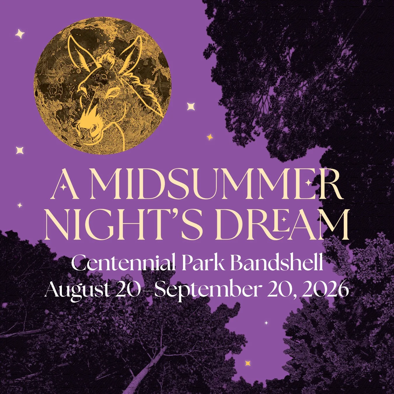
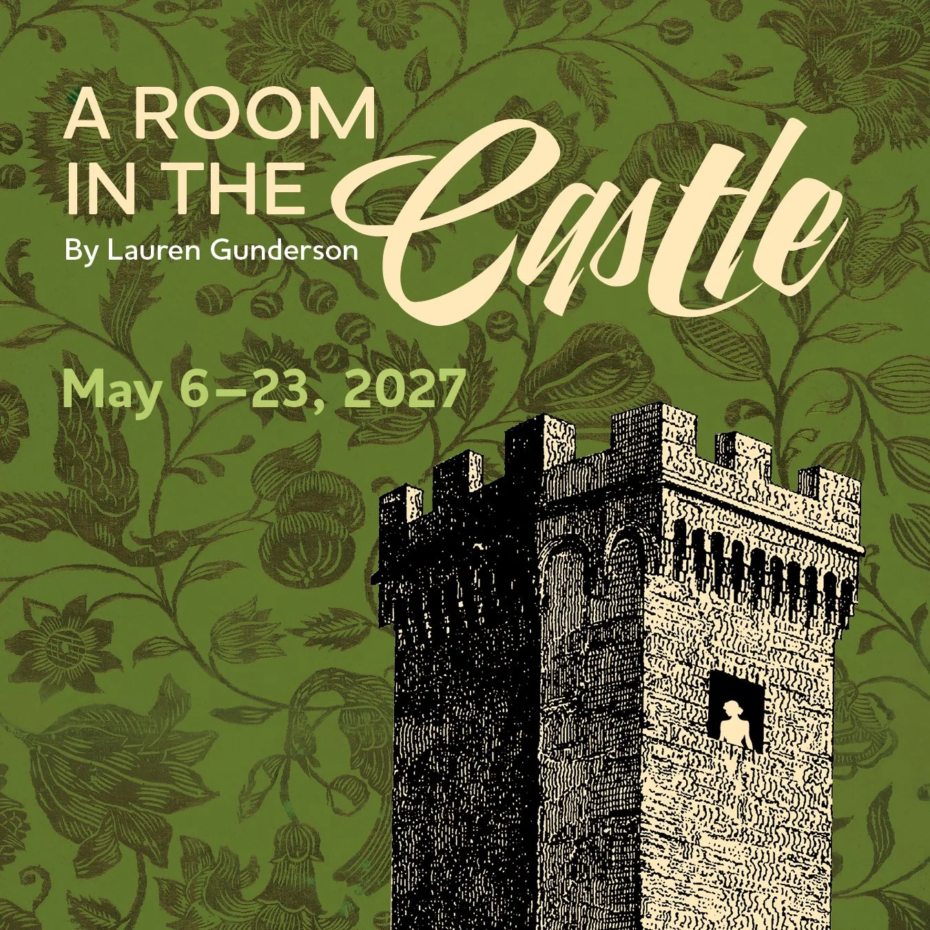
The Julius Caesar educational performance set design used chess as a metaphor for politics. I took three crumbling Roman columns and topped them with two knight chess pieces facing a king in the center. The Room in the Castle is Hamlet from the point of view of Ophelia, her handmaid, and Queen Gertrude. I took an isolated castle tower and female silhouette and topped it with Ophelia’s flowers. A Midsummer Night’s Dream will be NSF’s triumphant return to Nashville’s Centennial Park. Like Summer Shakespeare, the play takes place under the trees, moon, and stars. Comedy and magic are referenced in the silhouette of a donkey's head in the moon.
Pop-Up Shakespeare
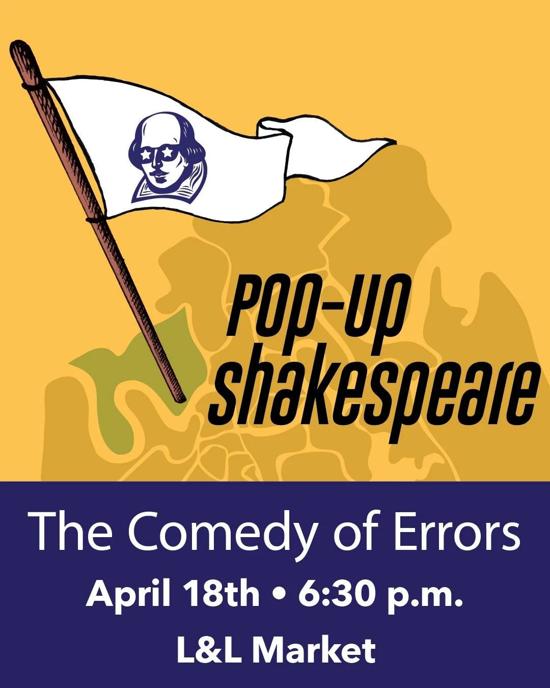
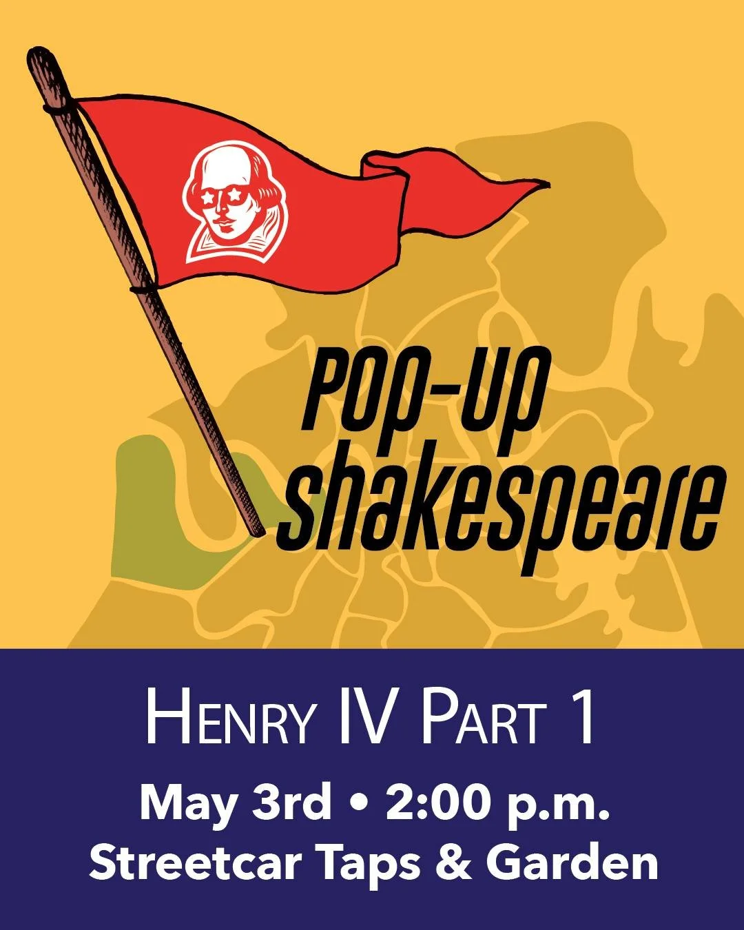
Nashville Shakespeare Festival hosts casual performances around town in the spring. They wanted to brand the series so it would become recognizable, but flexible enough to promote each performance individually in email and social media. Part of the fun is the unexpected locations—bars, patios, and shopping areas. I drew a simplified map of Nashville neighborhoods that can be moved below the flagpole to mark the next performance. In reference to the historical use of colored flags to identify the theme of a play, the color indicates whether it is a comedy, tragedy, history, or romance. This system is easy for staff to adjust and change for each performance.
An Extension in 2026-27
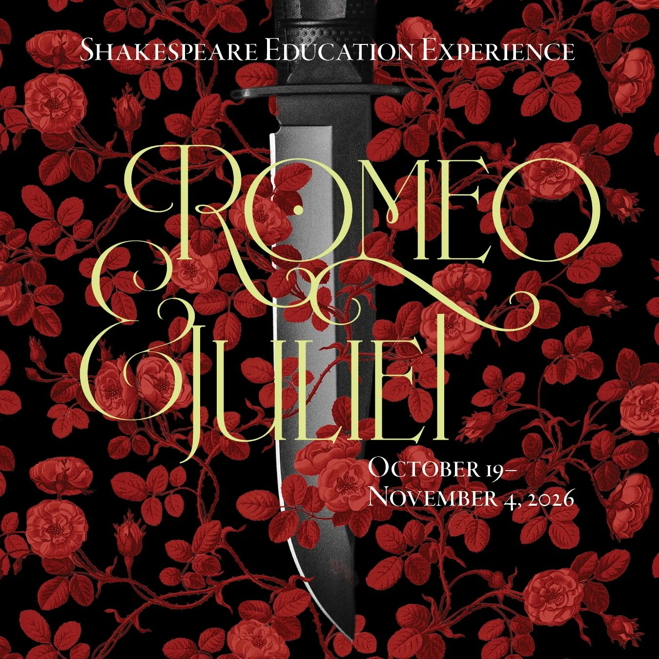
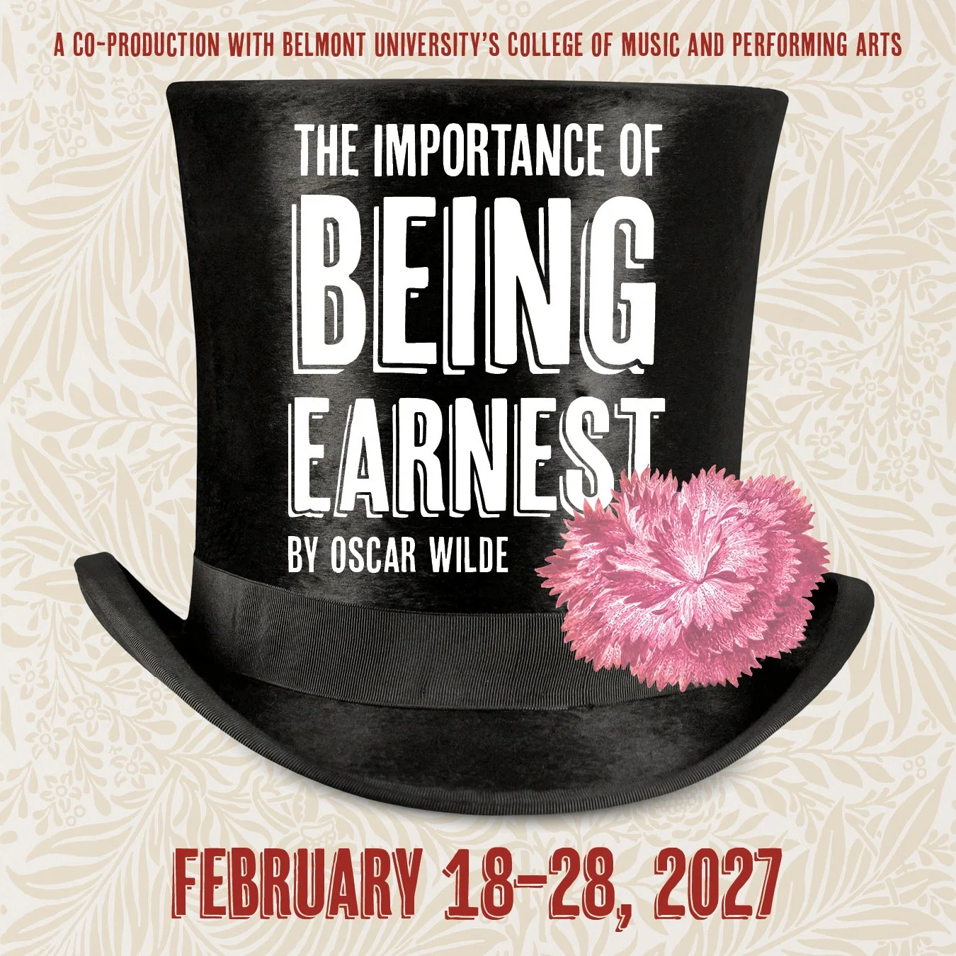
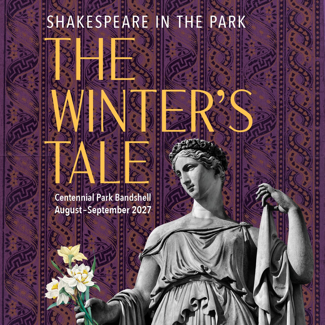
When A Room in the Castle had to be pushed back to 2027, Nashville Shakespeare Festival wanted to keep the poster design. I suggested we revise it slightly to have a slightly different look and theme for the 2026-27 Season. Together with the artistic team, we decided to include symbolic florals in each of the poster designs, and instead of a pure flood of color, I incorporated themed wallpaper into the backgrounds to set off a symbol representing each play.
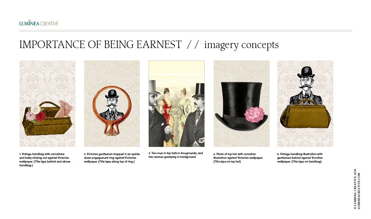
Imagery concepts for The Importance of Being Earnest poster design.
Romeo and Juliet has a knife intertwined with red roses against a black (tragedy) background. The Importance of Being Earnest has a top hat and carnation boutonnière against an off-white (comedy) botanical wallpaper. We moved the florals in the original Room in the Castle design to a green Renaissance tapestry, and for The Winter’s Tale, there is a purple-hued (romance) Greco-Roman wallpaper behind a female statue holding a bouquet of daffodils.
Working with Nashville Shakespeare Festival has been such a fun and rewarding experience, as we truly partner together to get the best result possible. I look forward to attending their return to Centennial Park this summer.
